

Hi There
MediPal is a student project that I completed for Google UX Professional Certificate. Even this is not an existing app in the market however, research is real, and the design was also created based on actual users and fellow student voices. I’m proud of this project, but I just wanted to be upfront with that.
Okay, Let's continue ↓
Role :
UX researcher / UI・UX designer
Project duration :
OCT - NOV 2021
Help people to prevent forgetting
their medications
Generally, getting older and older, the number of medications would also be increased however, some people feel technical difficulties, especially in the elder generation. Therefore, it is necessary to develop a product that can be easily operated by anyone, not to mention reminding people not to forget to take their medication.
Problem
- Forget medication
- App or website could be helpful but there is still technical difficulty for some users
- Some users are not used to tech products
Goal
- Develop a product that let users know to take their medication
- Product should have a simple user flow and user interface that never confuse users
Research
Goals
-
Discover how people's tips to remember to take their daily medications
-
Identify the factors that cause people to forget to take their medications
-
Understand the actions that are taken before taking the medication
-
Identify the demand for reminders to take medication
Research Components
-
User surveys
-
User personas
-
Competitive audits
The first thing that poses a challenge for many patients is the number of medications they take and the number of times they take them, as well as the different times they take them. Compared to patients with temporary illnesses such as colds, those with chronic illnesses tended to be less likely to forget to take their medications because they were in the habit of taking them. However, as the age of the patients increased, the number of times they forgot to take their medication inevitably increased, and there was no significant difference between those who took their medication daily and those who did not.
Insights #1
Elderly patients feel anxiety about tech products
Many patients would like to something let them know to take medications but they feel technical difficulty when they interact with digital devices
Insights #2
People rely on physical products
Some of the patients showed plastic boxes that have dividers that split up medicines by day.
Insights #3
Scheduling medications on a mobile device is a hassle
Especially when their medications are supposed to be taken at a different time, there are too many steps to let reminders work correctly.
"Sometimes tech products consume too much time to set, so I tend to use more physical solutions."
Contestant, 50s
Insights #4
Youth patients tend to use pill reminder
Pill reminder apps are widely used among young generations and it fits well with their lifestyle.
Insights #5
Smart speaker as a reminder
Some users let smart speakers remind them to take their medications.
Insights from survey and interview
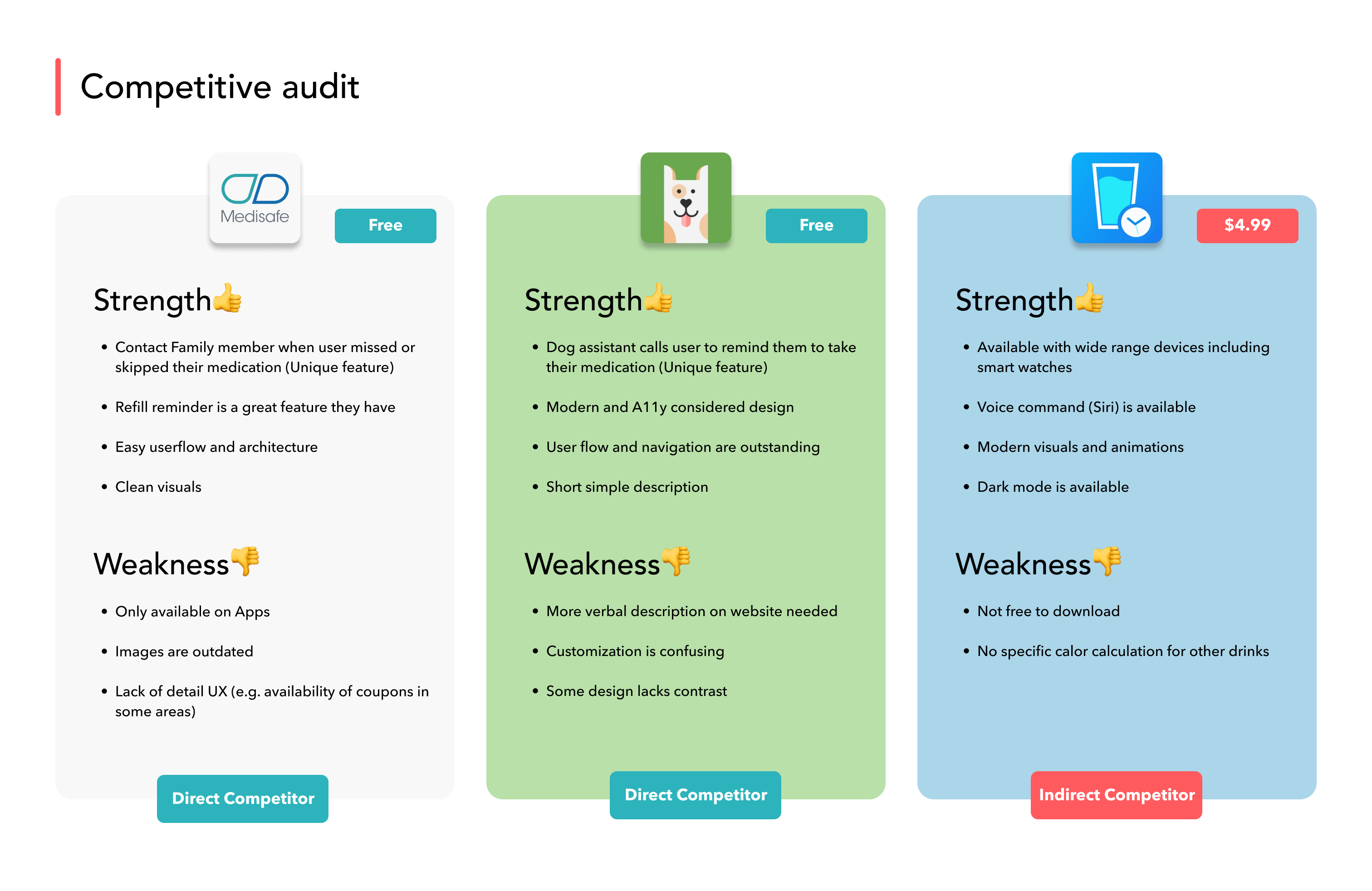
Competitive audit
The secondary story wasn't enough to know the opportunity in the market so I conducted a Competitor audit.
For Medipal project, I chose 3 different competitors in a similar field. Mediscal and MAX pill reminder are direct and Waterminder is an indirect competitor for Medipal.
User Persona
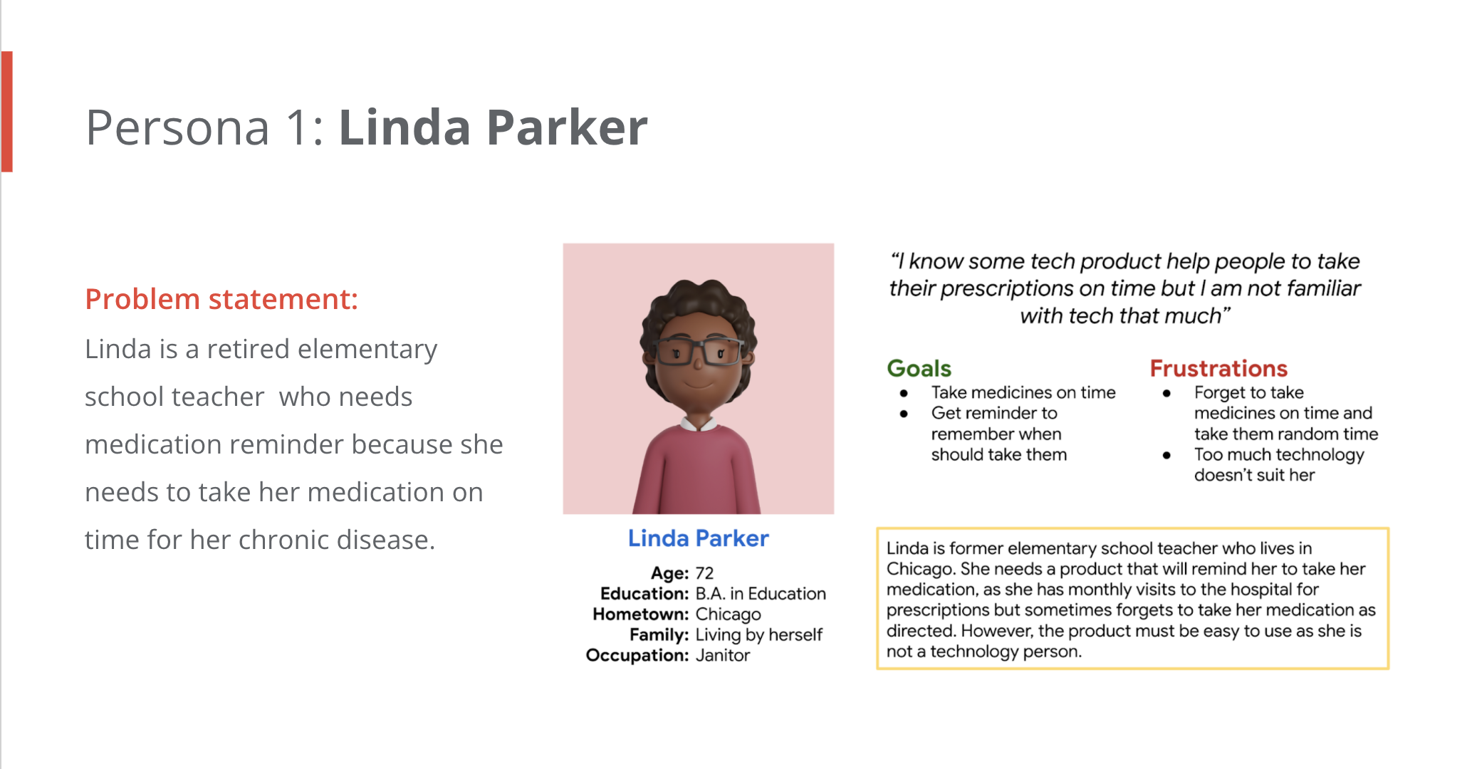
By conducting research and some studies, I could finally create a user persona that defines the user's pain points and goals.

Ideation
Crazy Eights helped me to ideate solutions to my challenge which helps users to take their medication on time.
Design
Digital Wireframe
When I was designing digital wireframes, accessibility for users was the top first priority. In particular, since the age range of the main users is expected to be high, I tried to create a design that can be operated intuitively even by users who are not familiar with digital products.

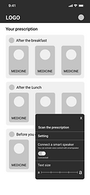


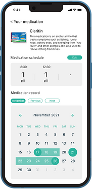
High contrast design let users notice which medicine should they take at the moment easier.
Too much setting or steps makes users confused so I reduced as much as I can.
e.g.) When user need to add a new medication, they only required to scan their prescription, so they don't need to type anything.
Usability consideration
Low fidelity prototype
I had to make sure the user flow was as simple as possible so I kept the design consistent and repeat the similar pattern for each screen. Here you can see or even try the digital low fidelity prototype.
Usability study and refine the design
Usability study overview
Study type
Unmoderated study
Location
Online (remote)
Participants
5 people*
* 20s (1person), 40s (2 people), 70s (2 people)
Findings from the usability studies
Findings #1
Function difficulty
Some participants show confused reactions when they see "+ button" for
adding new medicine in the app
Findings #2
Navigation
Some participants were not familiar with some icons and how they work in the navigation so it might be better to add text or change the navigation.
Findings #3
Improve navigation
Since navigation needs a little more work to avoid the confusion that some participants experienced, some of them mentioned that they are much familiar with the navigation bar than right side button.
BEFORE
AFTER


Refine the design
Since some users weren't familiar with the + icon as navigation, I changed it into navigation bar so that they can recognize it much easier.
BEFORE
Before the usability study, it wasn't clear how to turn off the notification. Therefore, I decided to add a "DONE" button to complete the task and turn off the notification so that the users can click the button when they finish taking their medication.

AFTER

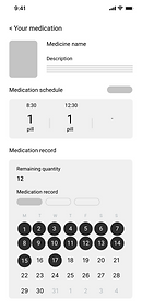
High fidelity prototype
All color applied in this design were well considered and they are perfectly low vision and A11y friendly.
High fidelity prototype
People struggled to add a new medication on Lo-fi ver. of the prototype,
so I change the user flow to make it much more obvious for them. Here you can try the prototype.
Mockups


Accessibility considerations

A11y matters
All color applied in this design were well considered and they are perfectly low vision and A11y friendly.
Right or Left-handed
By adding new medicine button in the center of the screen, user can tap it even if they are right or left handed.
Simple flow for elderly users
Main users could be elderly users so I reduced the number of steps they need to take in the middle of core tasks so that they can easily complete their medication.
Responsible designs

While the intent is to have users use this service through an application, the ability to access it from a variety of devices is a major advantage. Therefore, we have designed the website to be responsive so that it can be accessed from a computer as well. The website is completely responsive so users can access their data or account seamlessly without any confusion. Each has a different design attempt. For example, since the mobile website doesn't have a navigation bar, I applied the hamburger menu.
Takeaways
Impact
What I learned
The rate of completing the core task was increased after the design change so it means designs fit better as their tool to complete their goals.
Since 15% of the whole population has some kind of disability, we designers have to include them in the design and make it easy for them. Not only assistive technology but also color palette also could help people with disability.